One Idea – One Site: Why We Use Tilda for Landing Pages
At upline.studio, we believe that clarity wins. Especially when it comes to communicating a single product, service, or message online. That’s why we follow the principle:
One idea – one site.
And when we need to move fast, stay flexible, and deliver clean, high-converting landing pages, we often choose Tilda.
Why Tilda?
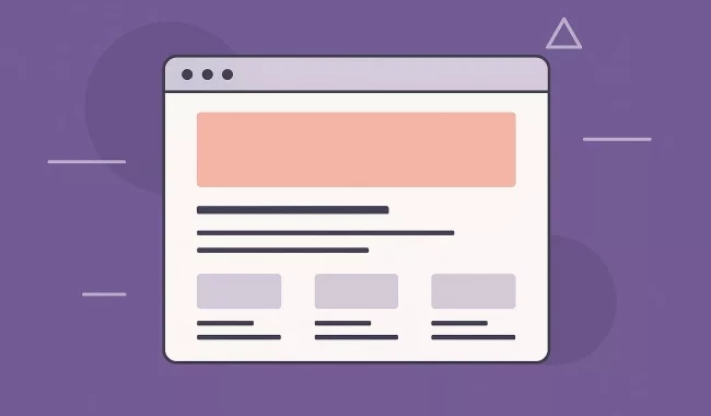
Tilda is a visual-first website builder with an emphasis on design freedom, speed, and structure. It gives us just the right balance between creative control and ready-to-use functionality. Perfect for landing pages, marketing campaigns, MVPs, and idea validation.
We've used it to build:
- Product launches
- Event or webinar pages
- Newsletter signup funnels
- Campaign-specific microsites
- Branded one-pagers
- Quick MVPs for startup ideas
If the goal is fast, beautiful, and conversion-focused, Tilda is often the best tool for the job.
Our Process: How We Build Tilda Landing Pages
- Brief + Core Message
We define the audience, message, and desired action. A good landing page should revolve around one clear goal. - Structure First
Using Tilda’s Zero Block or pre-built templates, we layout a clean and logical page structure—hero, pain points, solution, CTA, etc. - Visual Language
We add typography, imagery, animation, and scroll effects to enhance readability and engagement without distractions. - Mobile Optimization
Every landing page we create is fully responsive and tested on multiple devices. - SEO + Analytics Setup
We connect custom domains, set up meta tags, tracking, goals, and analytics tools like GA4, Hotjar, and Facebook Pixel. - Launch & Iterate
Because Tilda is no-code friendly, our clients can update content themselves—or we can easily tweak things for A/B testing.
The Advantages of Tilda for Landing Pages
- ⚡ Speed — Pages can go from idea to launch in a matter of days—not weeks.
- 🎯 Focused Design — The format encourages simplicity and high conversion rates by eliminating distractions.
- 🎨 Design Flexibility — With Zero Block, we can fully control layout, animation, spacing, and brand details.
- 🔧 Built-in Tools — Forms, CRM integrations, payment modules, analytics, and even a blog engine—all ready out of the box.
- 📱 Mobile-Ready by Default — No need to write separate mobile styles—Tilda handles it intuitively.
- 🤝 Empowering Clients — After launch, clients can edit texts, swap images, or duplicate sections without a developer.
When We Recommend Tilda
Tilda is perfect when you:
- Need to test an idea fast
- Want a standalone site for a specific campaign
- Don’t need a complex CMS or backend logic
- Care about clean design and mobile UX
- Want a site you can manage without code
For startups, solo founders, marketers, and even enterprise teams running campaigns—Tilda lets you move fast and look great doing it.
Final Thoughts
At upline.studio, we use the right tool for the right job. For landing pages, that often means Tilda—because not every idea needs a full-stack solution.
If you’ve got a clear message, a focused product, or a time-sensitive campaign, a dedicated landing page might be your best move.
One idea. One page. One goal.
Let’s build it.